

The New York Yankees color palette wins through restraint: deep navy, white, gray, and a sharp touch of red create one of baseball’s most recognizable identities. Compared with brighter MLB teams, the Yankees use fewer colors and less visual noise, which makes the brand feel older, cleaner, and more serious.
TLDR: The Yankees colors are built around navy, white, gray, and red, while many MLB teams use louder pairings such as blue and orange, green and gold, or black and orange. For example, a side-by-side retail wall with 30 MLB caps often makes the Yankees cap stand out because it uses one dominant dark color and one clean white logo. In a simple brand recall scenario, a shopper could identify the Yankees cap in under 3 seconds, while teams with busier color sets may take longer. That simplicity is the whole point.
Yankees Colors at a Glance
The core New York Yankees colors are usually read as navy blue, white, gray, and red. Navy carries most of the brand. White gives the logo its punch. Gray supports road uniforms. Red appears in the bat, seams, and smaller marks tied to the classic Yankees script logo.
- Navy blue: often listed as #003087
- White: #FFFFFF
- Gray: often shown near #C4CED4
- Red: often listed as #E4002C
The exact shades can shift across fabric, print, digital screens, and vintage assets. That can be annoying for designers. Honestly, it feels like matching a Yankees cap, jersey, and web graphic should take one minute, yet color differences in materials can add ten extra minutes of checking.

Why the Yankees Palette Feels Different
The Yankees do not rely on bright color contrast to get attention. They rely on shape, history, and repetition. The interlocking “NY” logo is so familiar that it does not need neon trim or a loud secondary color. The palette feels strict, almost formal.
The home uniform proves the point. White fabric. Navy pinstripes. Navy cap. No names on the back. Very little decoration. It is not playful. It is not trying to chase trends. It is controlled, and that control is part of the franchise image.
That separates the Yankees from many MLB teams. Baseball has plenty of colorful brands. The Yankees sit closer to a luxury label than a typical sports identity. Their colors say tradition, discipline, and New York pressure.
Yankees Navy vs Dodgers Blue
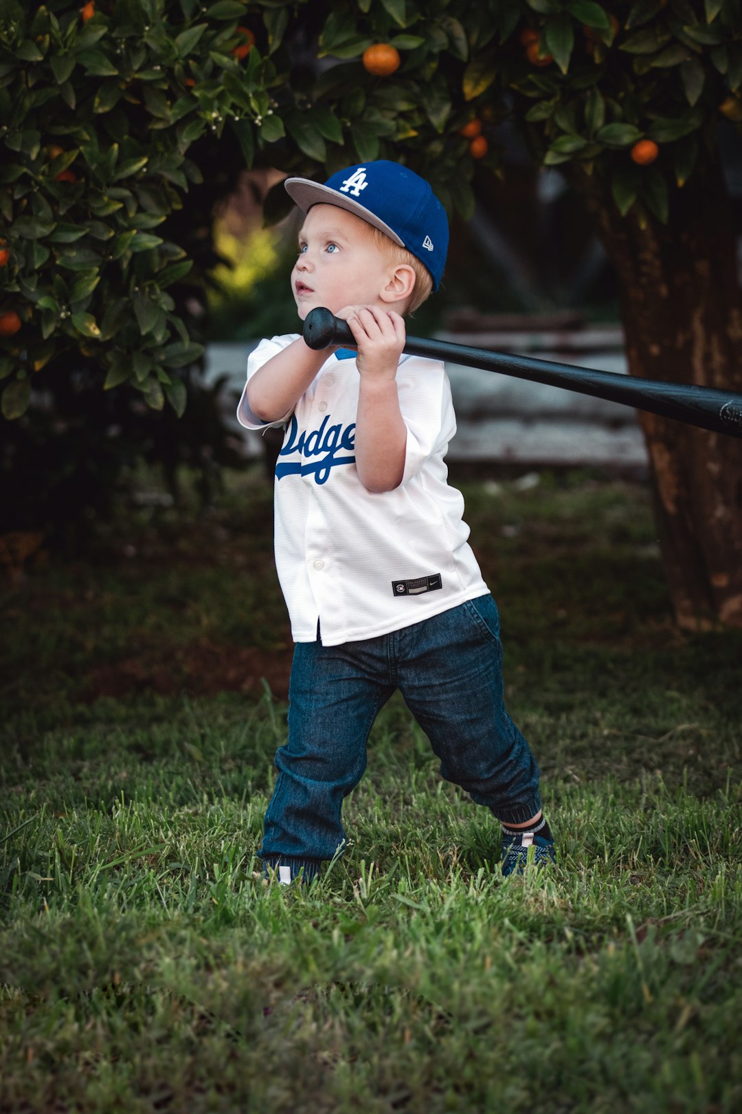
The Los Angeles Dodgers also lean hard on blue and white. But their blue is brighter and friendlier. Dodgers blue has more pop, especially on sunny broadcasts and white jerseys. It feels West Coast, open, and energetic.
Yankees navy feels heavier. It carries more formality. A Dodgers cap reads as sporty and clean. A Yankees cap reads as iconic and urban. Both are simple, but they do not create the same mood.
- Yankees: dark navy, reserved, formal
- Dodgers: royal blue, bright, relaxed
Yankees Colors vs Red Sox Colors
The Boston Red Sox use navy, red, white, and gray too, so the comparison is natural. The difference comes from emphasis. Boston gives red a much bigger role. Red socks, red lettering, red trim, and red merchandise make the palette feel warmer and more aggressive.
The Yankees use red more sparingly. It appears as an accent, not the main signal. That choice matters. It stops the brand from feeling too loud and keeps navy in control.
This contrast fits the rivalry. Boston’s colors feel scrappy and emotional. New York’s colors feel buttoned-up and stern. Neither is accidental.
Yankees Colors vs Mets Colors
The New York Mets use blue and orange, a much brighter pairing. Their palette was designed with city history in mind, combining colors linked to earlier New York baseball clubs. The result is bold, local, and easy to spot.
Against the Mets, the Yankees look more restrained. The Mets palette feels louder on caps, jerseys, and social graphics. The Yankees palette feels more permanent. One shouts. The other stares.
Image not found in postmetaHow the Yankees Compare With Colorful MLB Teams
Some MLB teams are built around high-contrast color stories. The Oakland Athletics use green and gold. The Baltimore Orioles use black and orange. The San Diego Padres use brown and gold. The Miami Marlins use black with bright accent colors.
Those palettes are more expressive. They are easier to theme for special events, alternate jerseys, and social campaigns. They also risk looking dated faster if trends shift. The Yankees avoid that problem by staying plain, almost stubbornly so.
It drives some uniform fans crazy that the Yankees rarely change much. Yet that refusal is part of the appeal. The team does not need city connect chaos or constant refreshes to sell caps. The standard navy cap already does the job.
Why Navy and White Work So Well
Navy and white form one of the cleanest pairs in sports branding. The contrast is strong. The colors reproduce well. They work on wool caps, cotton shirts, signs, scoreboards, apps, and TV graphics.
For the Yankees, navy also has cultural weight. It connects with uniforms, authority, old New York style, and classic menswear. White keeps the whole system from feeling too heavy. Gray adds a road-game feel without fighting the main palette.
The pinstripes are the hidden weapon. They add texture without adding another color. That lets the Yankees create visual interest while keeping the palette tight.
Merchandise Impact
Yankees colors transfer unusually well to fashion. A navy cap with a white “NY” can be worn by people who do not follow baseball. That is rare. Many MLB caps clearly look like team gear first. The Yankees cap often works as a streetwear item first and sports merchandise second.
This matters in global sales. A simple palette travels better across markets. Navy and white do not require local explanation. The logo carries the New York link. The colors keep it wearable.
Which MLB Palettes Are Closest to the Yankees?
The closest palettes belong to teams that also use navy, white, red, and gray. The Red Sox, Atlanta Braves, and Washington Nationals share parts of that family. Still, each team uses red more heavily than the Yankees.
The Yankees stand apart because their main look is nearly monochrome. Navy and white do most of the work. Red stays in the background. That makes the identity feel less like a standard patriotic sports palette and more like a strict club uniform.
What Other Teams Can Learn From the Yankees
- Limit the palette. Fewer colors can create stronger recall.
- Own one dominant color. Yankees navy is instantly linked to the team.
- Use accents carefully. Red works because it does not compete with navy.
- Keep uniforms consistent. Repetition builds memory over decades.
- Let the logo breathe. The white “NY” stands out because the cap stays simple.
The Yankees colors are not the flashiest in MLB. They are among the most effective. While other teams use brighter combinations to create excitement, the Yankees use restraint to create recognition. That is why the navy cap and white logo remain a benchmark for baseball branding.
FAQ
What are the official New York Yankees colors?
The main Yankees colors are navy blue, white, gray, and red. Navy and white are the most visible colors across caps and home uniforms.
What color is the Yankees navy blue?
Yankees navy is commonly represented as #003087, though the shade can vary by fabric, lighting, and production method.
Why do the Yankees use pinstripes?
The pinstripes are part of the team’s classic home uniform identity. They add texture while keeping the palette simple and clean.
How are Yankees colors different from Dodgers colors?
The Yankees use a darker navy, while the Dodgers use a brighter royal blue. The Yankees look more formal. The Dodgers look lighter and more relaxed.
Do the Yankees and Red Sox use similar colors?
Yes. Both teams use navy, red, white, and gray. The Red Sox feature red more heavily, while the Yankees keep red as a smaller accent.
Why is the Yankees cap so popular outside baseball?
The cap is simple, wearable, and strongly tied to New York. The navy and white palette works with many outfits, so it reaches far beyond sports fans.